Google Redesign
Last time updated 1st/01 2018
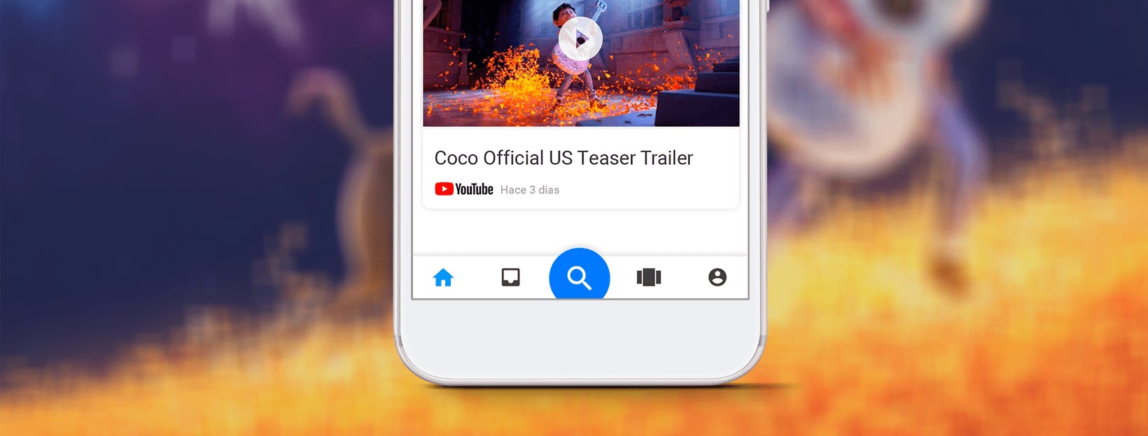
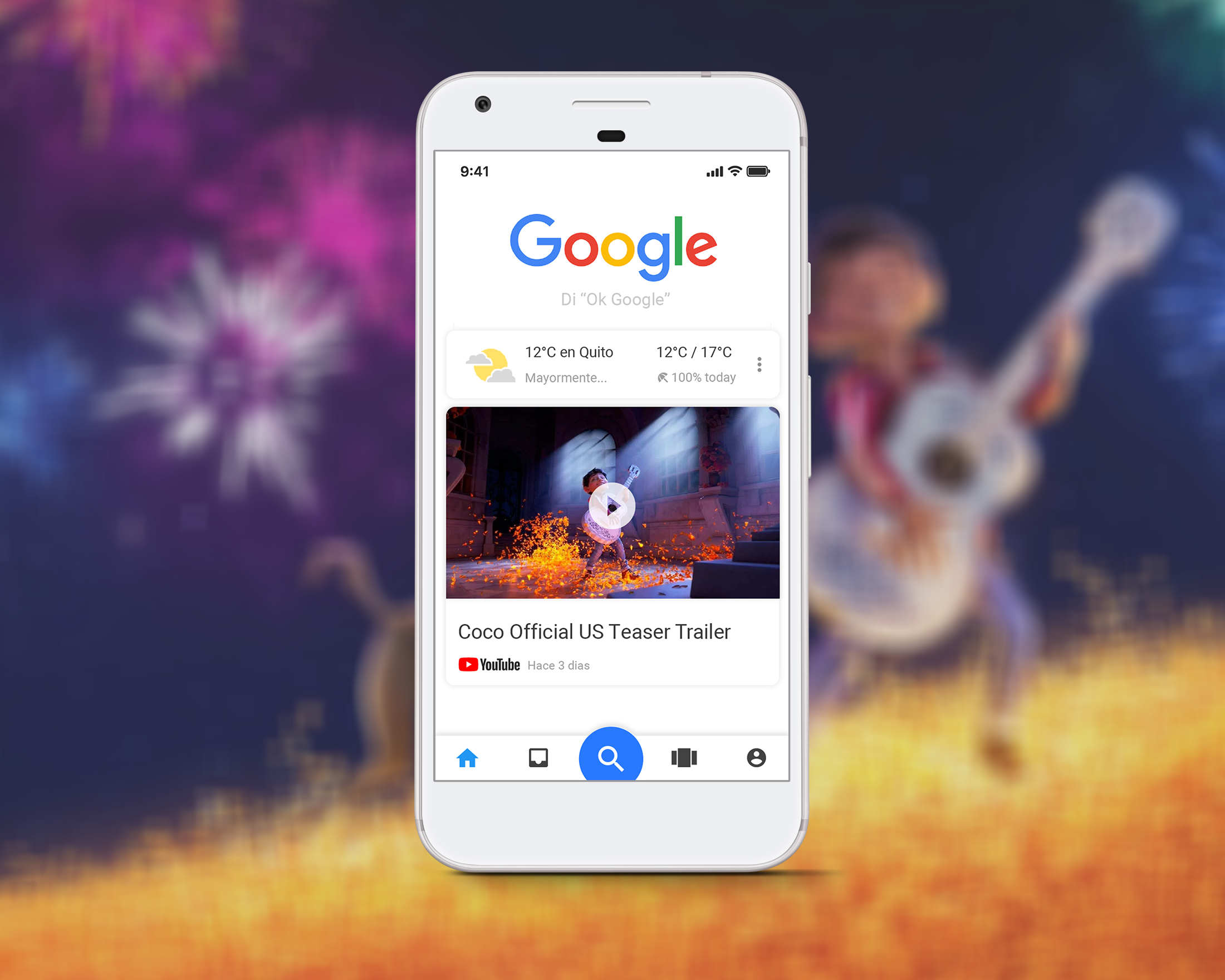
A new way to search for what you need in the Google ecosystem in a single application.
This is one of the funniest designs I've ever made. I wanted to synthesize many of the functions of the different applications that google offers, in one. This I did thinking that the main google application would be functionally similar to the desktop of your cell phone.
In this design exercise, I integrated popular functions of google applications, such as YouTube, Drive or Ads, in which I highlight functionalities such as "find a file" of your personal drive or "search for a playlist" of Youtube.
The design style is now classic Material Design, with an important emphasis on cards and shortcuts. The idea was that you could discover new functions or other google applications while interacting with the interface.
